

Sliders are a way of presenting information to users in an engaging way while making good use of available space on a webpage.
Building sliders with plain Javascript can be tough for beginners and might still be for more experienced developers. If you need a Slider and don't want to worry about writing too much javascript code, then Swiper is just the right option.
What is Swiper?
Swiper aka SwiperJs is a Javascript Plugin for creating modern touch sliders for websites. Swiper is hardware accelerated which means transitions run faster and more efficiently.
Swiper provides a host of functionalities for customizing slides, this makes it easily the best Javascript slider plugin. Some cool features of Swiper include:
- Touch Movement Interaction
- Responsive Breakpoint
- Full Navigation Control
- Built-In Transitions
- Doesn't require any Javascript Library
In this article, you will learn how to set up Swiper in a project to create cool and responsive touch sliders. And we'll be building a product card slider using some of Swiper's features.
Setting up Swiper
Swiper provides different ways to include it in a project. But for this article, we'll be using Swiper from a CDN. This should be added to our HTML head.
<link rel="stylesheet" href="https://unpkg.com/swiper@8/swiper-bundle.min.css"/>
Next, we'll add the script tag to the end of the body element in our HTML.
<script src="https://unpkg.com/swiper@8/swiper-bundle.min.js"></script>
The Swiper HTML Layout
This markup includes some of Swiper's most used functionalities. Like pagination, navigation and scrollbar.
<!-- slide main container -->
<div class="swiper">
  <!-- wrapper for slides-->
  <div class="swiper-wrapper">
    <!-- Slides -->
    <div class="swiper-slide">Slide 1</div>
    <div class="swiper-slide">Slide 2</div>
    <div class="swiper-slide">Slide 3</div>
    ...
  </div>
  <!-- Pagination  -->
  <div class="swiper-pagination"></div>

  <!-- Navigation buttons -->
  <div class="swiper-button-prev"></div>
  <div class="swiper-button-next"></div>

  <!-- Button scrollbar -->
  <div class="swiper-scrollbar"></div>
</div>
The .swiper class is the overall container for all of the components of our slides.
The .swiper-wrapper class contains all the slides.
The .swiper-slide class is the slide component.
Initializing Swiper in our Project
const swiper = new Swiper('.swiper', {
    //settings
});
The variable .swiper is used to create an instance of the Swiper object, allowing us to access methods from the Swiper API. These methods will come in handy later.
Swiper Code for Functionalities
For the slider functionality to work, add the parameters to the Swiper settings when Swiper is initialized.
const swiper = new Swiper('.swiper', {
  // Optional parameters
  loop: true,

  // If we need pagination
  pagination: {
    el: '.swiper-pagination',
  },

  // moving to next and previous slides
  navigation: {
    nextEl: '.swiper-button-next',
    prevEl: '.swiper-button-prev',
  },

// And if we need scrollbar
  scrollbar: {
    el: '.swiper-scrollbar',
  },

});
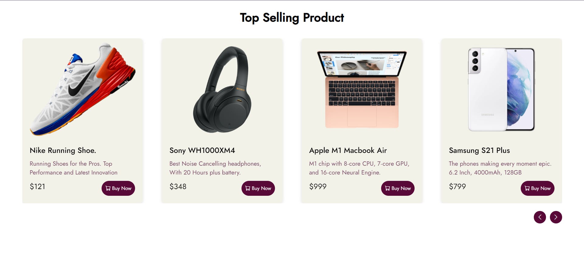
Building our Product Card Slider
Since we now understand how Swiper works in a project and can use some of Swiper's functionality. We'll use Swiper to create a product card slider for a fictional e-commerce website.
The HTML and CSS for our Products Card
This is the bare structure for the HTML. To save space some HTML and CSS codes are not included in the snippet below. You can find them in the codepen.
<div class="swiper">

  <div class="swiper-wrapper">
    <!-- Slides -->
    <div class="swiper-slide">Product 1</div>
    <div class="swiper-slide">Product 2</div>
    <div class="swiper-slide">Product 3</div>
    <div class="swiper-slide">Product 4</div>
    <div class="swiper-slide">Product 5</div>
    ...
  </div>

  <div class="custom-nav">
    <div class="prev">
      <i class="bi bi-chevron-left"></i>
    </div>
    <div class="next">
      <i class="bi bi-chevron-right"></i>
    </div>
  </div>

</div>
`
Swiper Functionality
We can't add padding and margin to the main slide component, so we use spaceBetween to add 30px margins to our slides
The autoplay parameter changes the slide without interaction. The delay property is used to specify the time between transitions during autoplay.
The breakpoints parameter sets the number of slides to be shown based on the size of the screen. Note: It goes from Desktop to Mobile.
const swiper = new Swiper('.swiper', {
      //To add margin to slides
      spaceBetween: 30,

      autoplay: {
        delay: 6000,
       },

      //Breakpoints for Responsive slides
      breakpoints: {
        640: {
          slidesPerView: 1,
          spaceBetween: 20,
        },
        768: {
          slidesPerView: 2,
          spaceBetween: 40,
        },
        1024: {
          slidesPerView: 4,
          spaceBetween: 50,
        },
      },
    });
Handling Navigation with Slide Methods
As I mentioned earlier, we will be using Swiper slide methods for navigation.
For the custom navigation, add an event listener to the .prev and .next
HTML elements to listen for clicks then call the slide methods.
//next slide
document.querySelector('.next').addEventListener('click', function(){
    swiper.slideNext();
})

//previous slide
document.querySelector('.prev').addEventListener('click', function(){
   swiper.slidePrev();
})
This will create a touch slider, that changes to the next slide after 6 seconds and reduces the number of slides depending on the screen size.
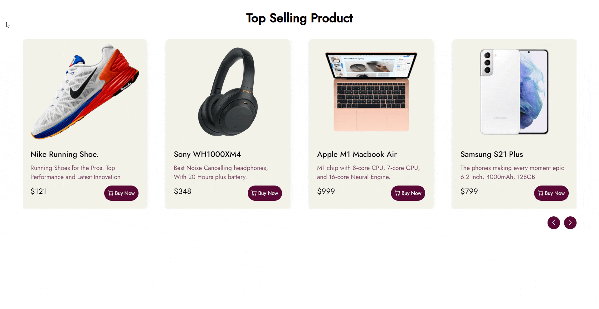 Demo of completed project
Conclusion
Swiper makes creating and handling sliders easy for developers and provides plenty of functionalities. Visit Swiper to check out more features and functionalities.
I believe this can help web developers build better websites. If you've made it to the end of my very first article. Leave a ❤️.
I appreciate feedback on my writing and would love to improve. Comment below or message me on Twitter. Thanks.